I'd like to inform everyone that my work is already officially finished and has been sent to Shiro Games directly. I won't be posting my full work until Monday though, when the entries are posted on Facebook for people to vote for.
Until then, have another preview!
I'll be honest. I'm not very good with creating backgrounds. For those who have been following me for a while now, or those who have seen the stuff I've drawn frequently, I'm sure you're aware of that. Nearly my whole life so far I've drawn more characters instead of landscape images, and if I drew anything landscape it would usually classify under three categories: awkward, messy, or has too many straight lines.
Simply put, the background was the hardest thing I've done in this project aside from Fina's hands.
My original concept for the background was something similar to one of Evoland 2's promotional artworks. I'd have all five main characters in, with Ceres looming in the background. But then I realized what are the chances other people are going to end up doing the same thing? There's not a lot of Evoland 2 artwork and fan art out there, and it's likely many of the participants will base inspirations from the artbook itself.
So I scrapped the idea, but kept my draft of Ceres with me. I still wanted to add her to my final product.
Next I wanted to replicate the background for the final boss battle's second phase. Seemed easy enough, though I needed to put a grid so I can easily recreate the symbols in the background similar to how I make pixel art in Minecraft. But I scrapped the idea too, because the background was too simple. It felt like I was trying to take the easy way out and I didn't like that. I still kept the symbols I made, just in case I found a new use for them.
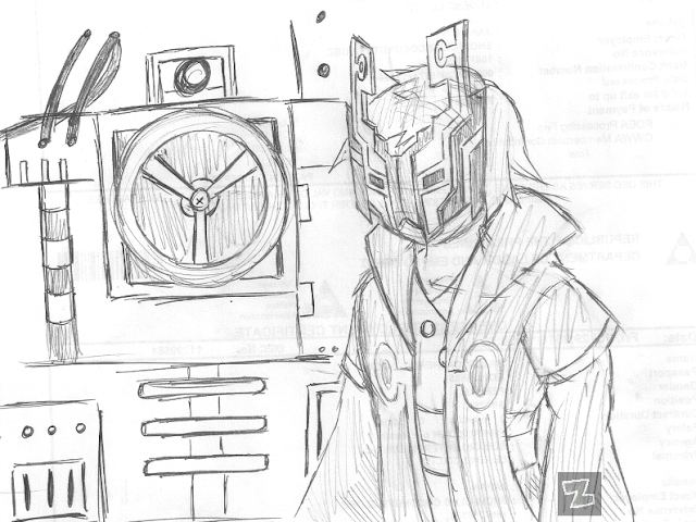
I created a new draft. This time I wanted to incorporate the concept of the Anomaly and significant events/places/characters in the game, such as Tiki or the Cursed Isle. I immediately went to work drafting the scenes I wanted to see, and I wanted it to look like timelines coalescing together through the Anomaly. Below are the drafts of these images:
Tiki, with Kuro on the Flying Wing beside it.
Professor Giro and the Weapon.
The Cursed Isle's Magilith.
Unfortunately, this was pushing me to do too much; there were so many other things I needed to learn before I could achieve the background and the effects I wanted. What's worse, around this time it was the last weekend before the deadline. I needed to go for something else that I could easily accomplish with my current skill level.
I was stumped for a time, a whole day, 6 days before the deadline. I needed to hurry, but I didn't know what to do, and I felt like I was wasting so much precious time. Nonetheless I needed to rack my mind up for ideas. I needed something, anything, that would make my background look so much better while blending perfectly with how I designed my characters. I needed a better theme too. I wanted it to look worth printing on a poster.
I browsed the artbook again for inspiration. I noticed the gears that were discreet in the background of each page like PowerPoint templates. An idea got me but wasn't enough to win me over at the time: the background's theme would be a clock and it's inner mechanism, with a Magilith overlooking everything else. I drafted it anyway.
After some tinkering here and there with a few ideas, I finally ended up with a final draft for my background's design. This final design (as you can see in the sneak peek screenie I've posted above) was mainly inspired this Hyper Light Drifter fan art that I found on DeviantArt:
Here I delve further into the backstory of the symbols behind my final background.


No comments:
Post a Comment